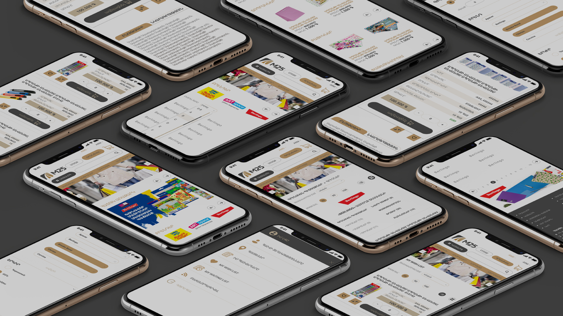
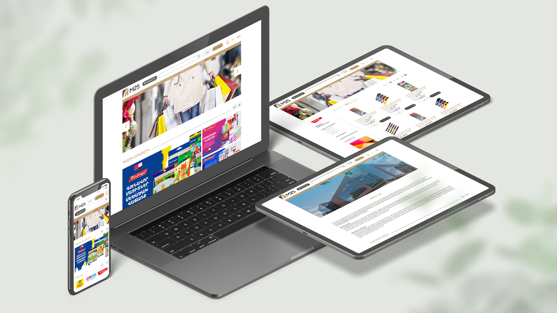
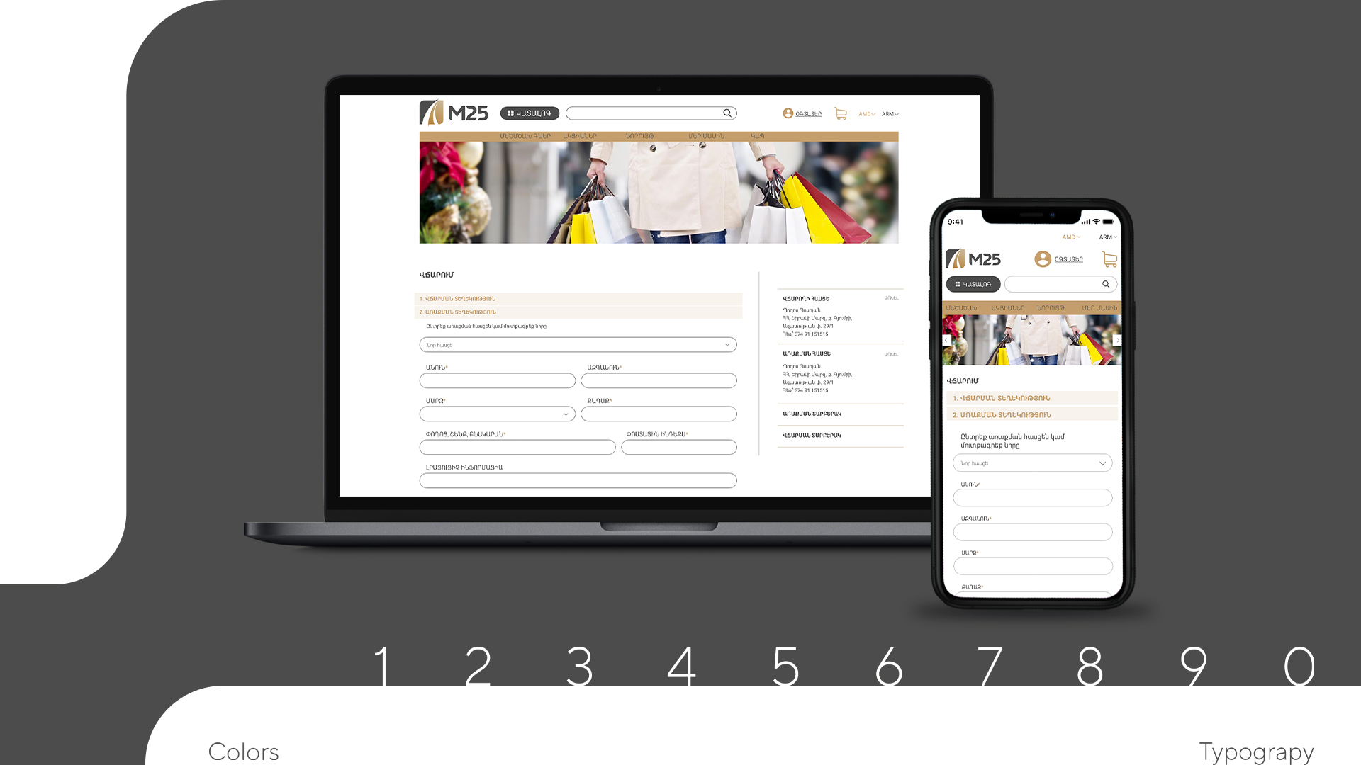
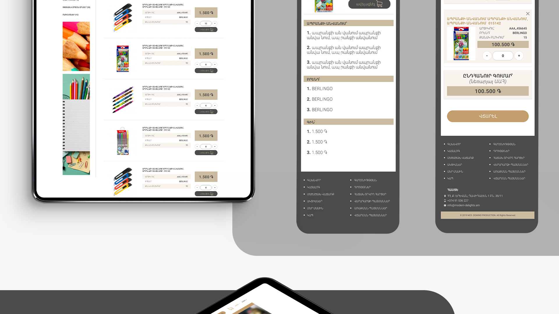
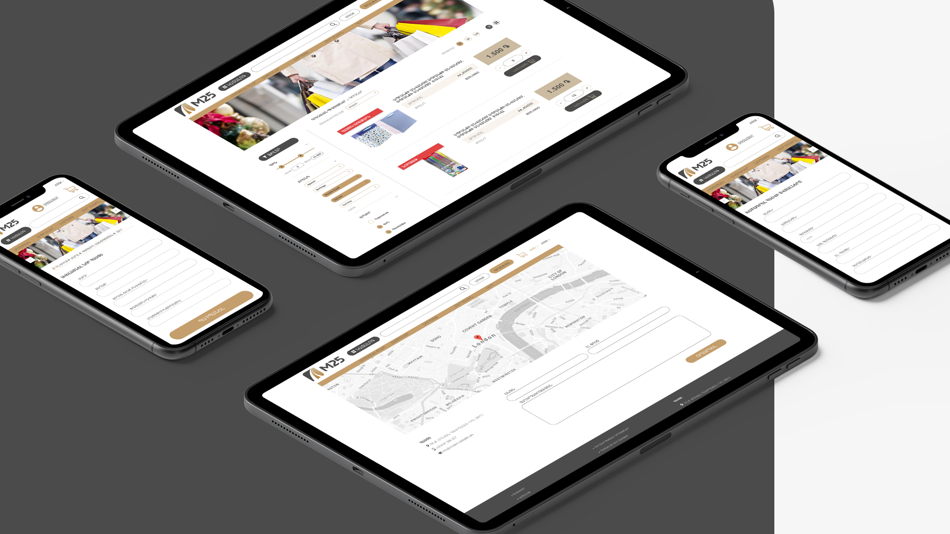
One of the leading importers of stationary in the country
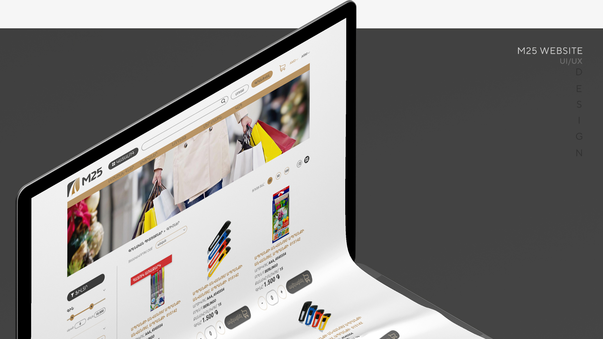
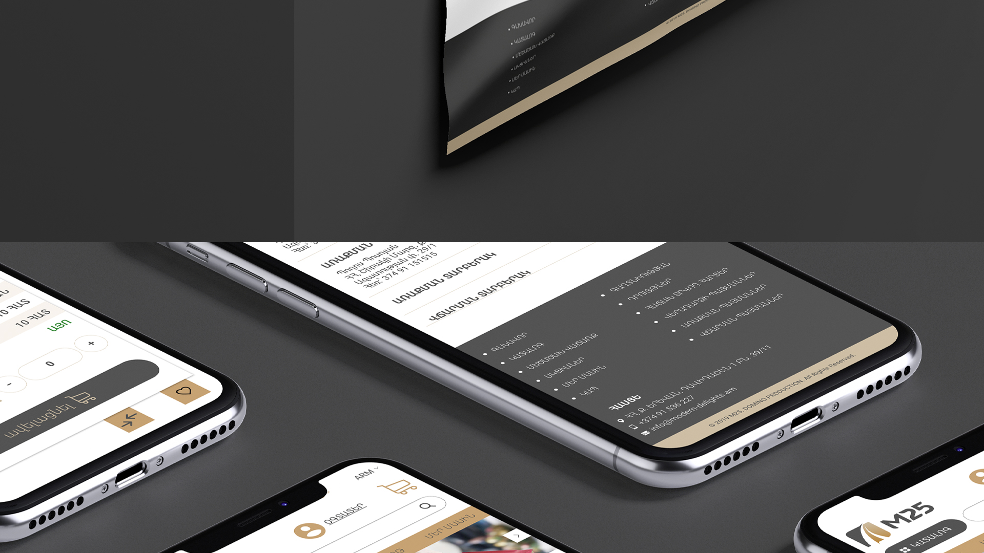
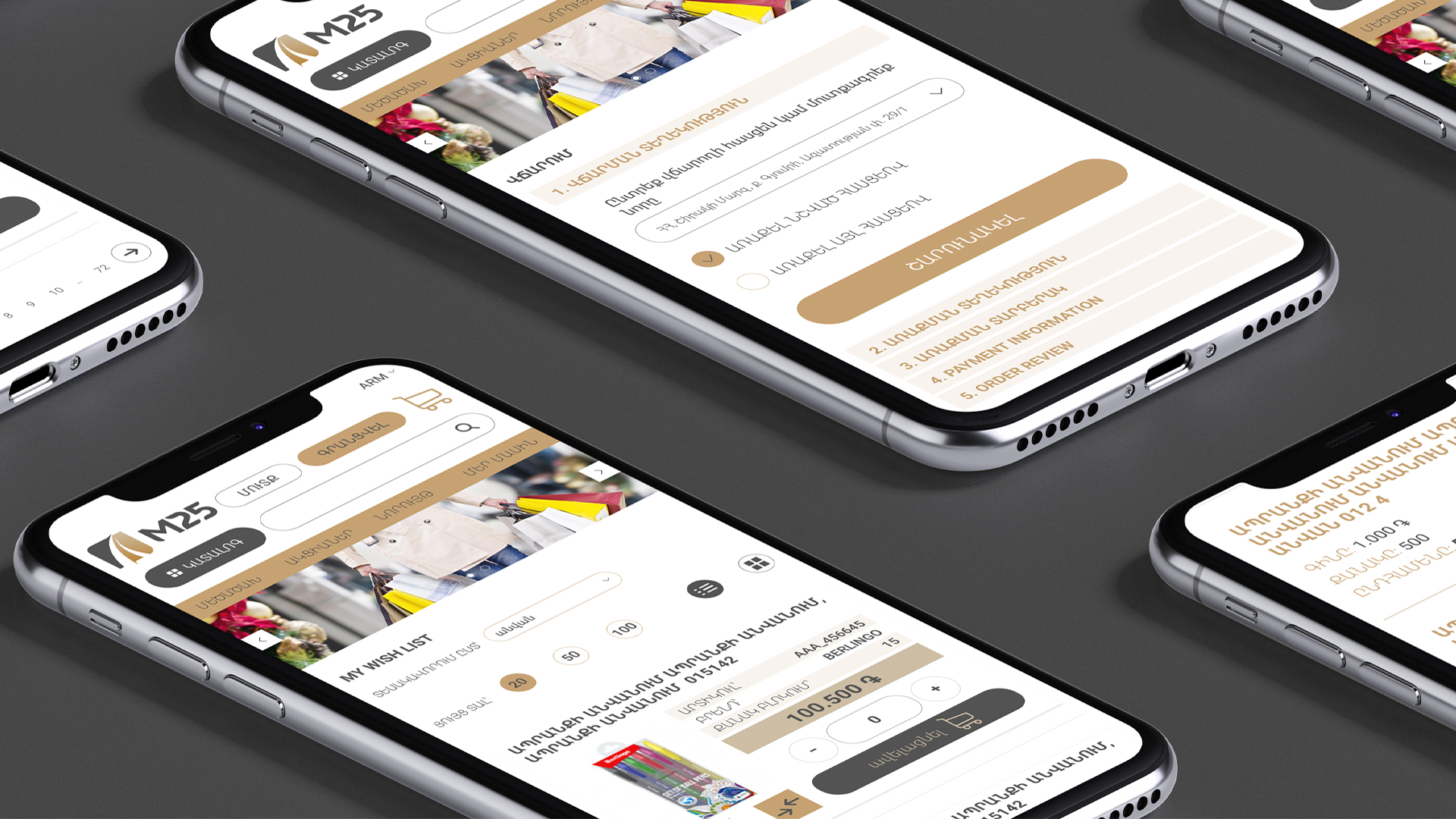
M25
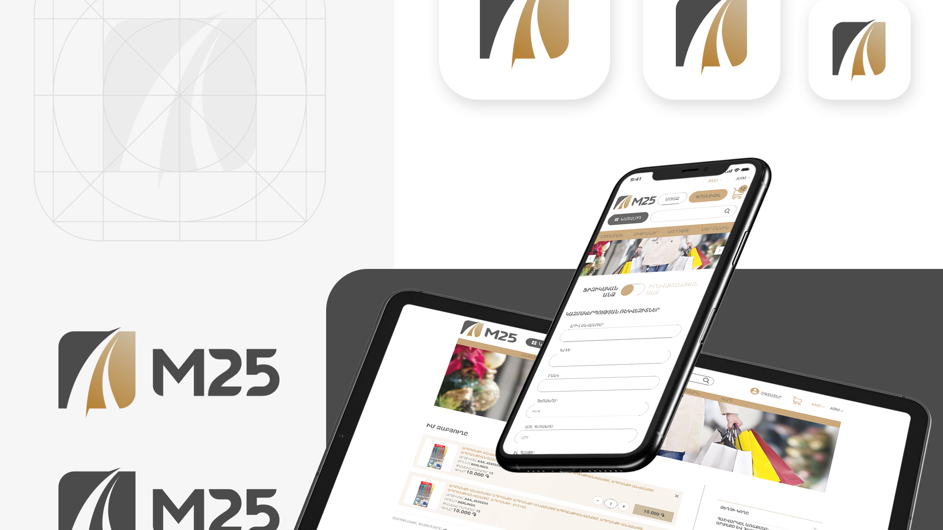
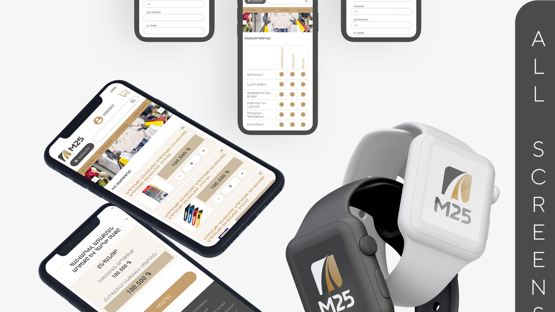
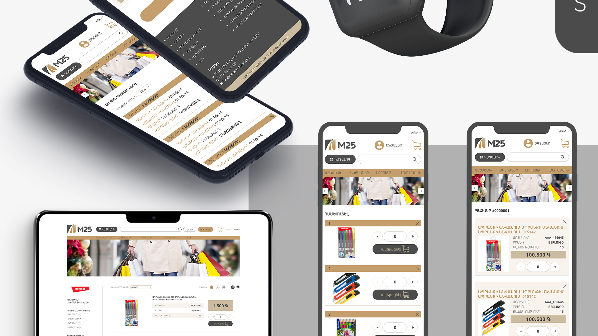
M25 BRANDING AND APPLICATION
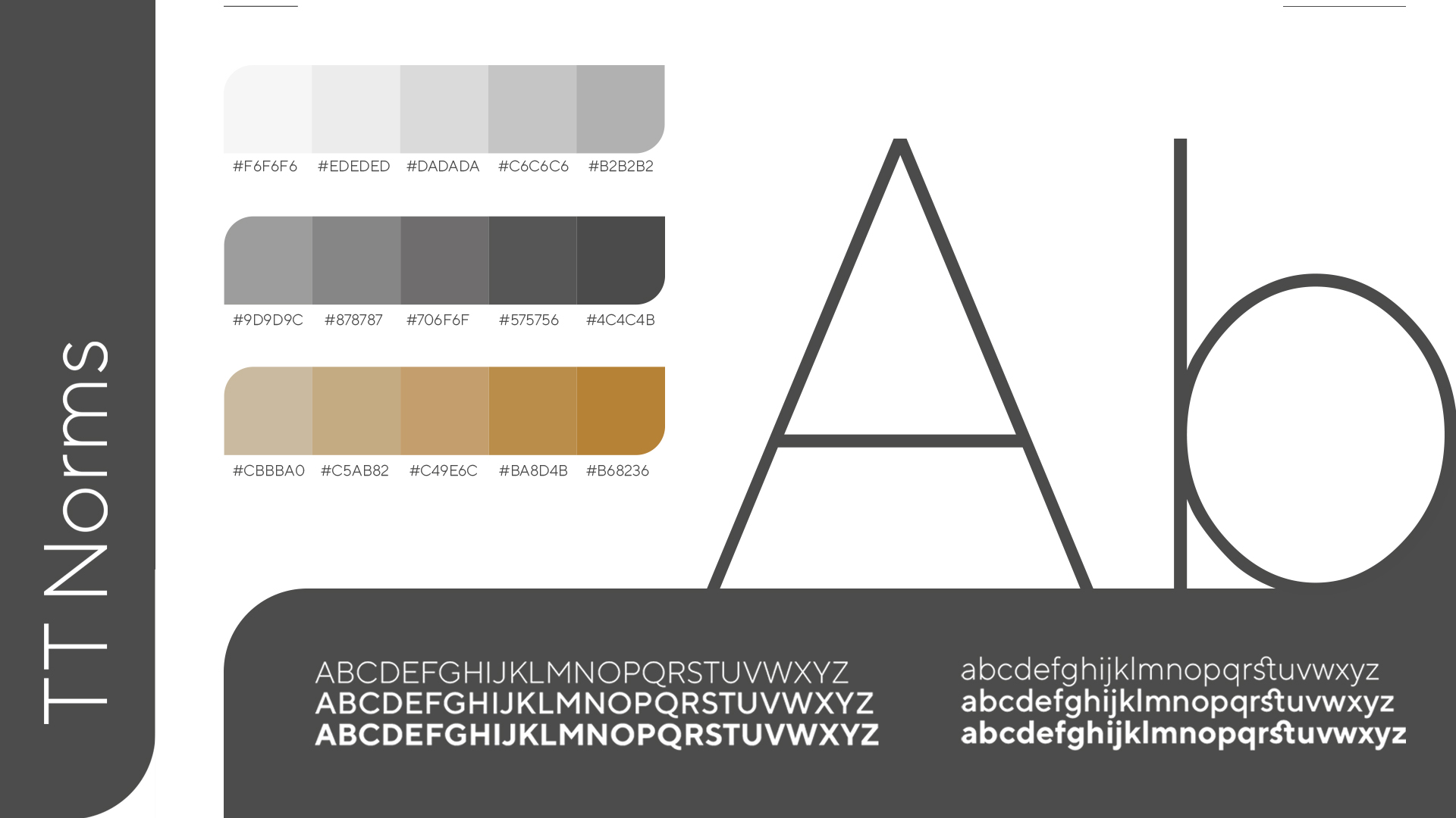
WE CHOOSE THE COLOR OF COMPROMISE WHICH ENSURES SERENITY
M25
2020
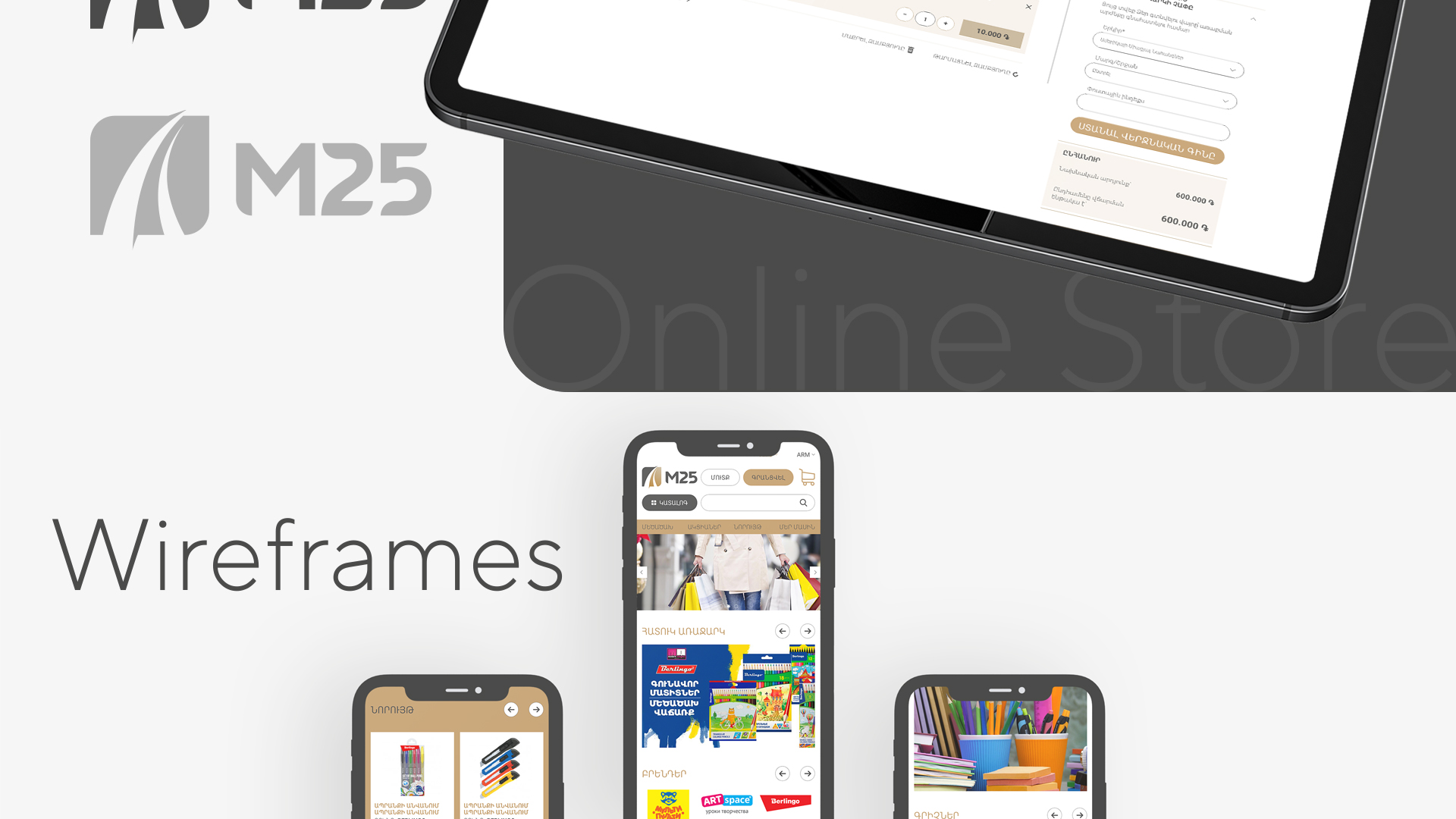
UI/UX

STATIONARY! THE IMPORTANCE OF THE PRODUCT IS BIGGER THAN IT SEEMS
WHEN YOU MANAGE TO COMBINE THE BRIGHTNESS OF THE PRODUCTS AND THE ASCETICISM OF THE BRAND COLOR
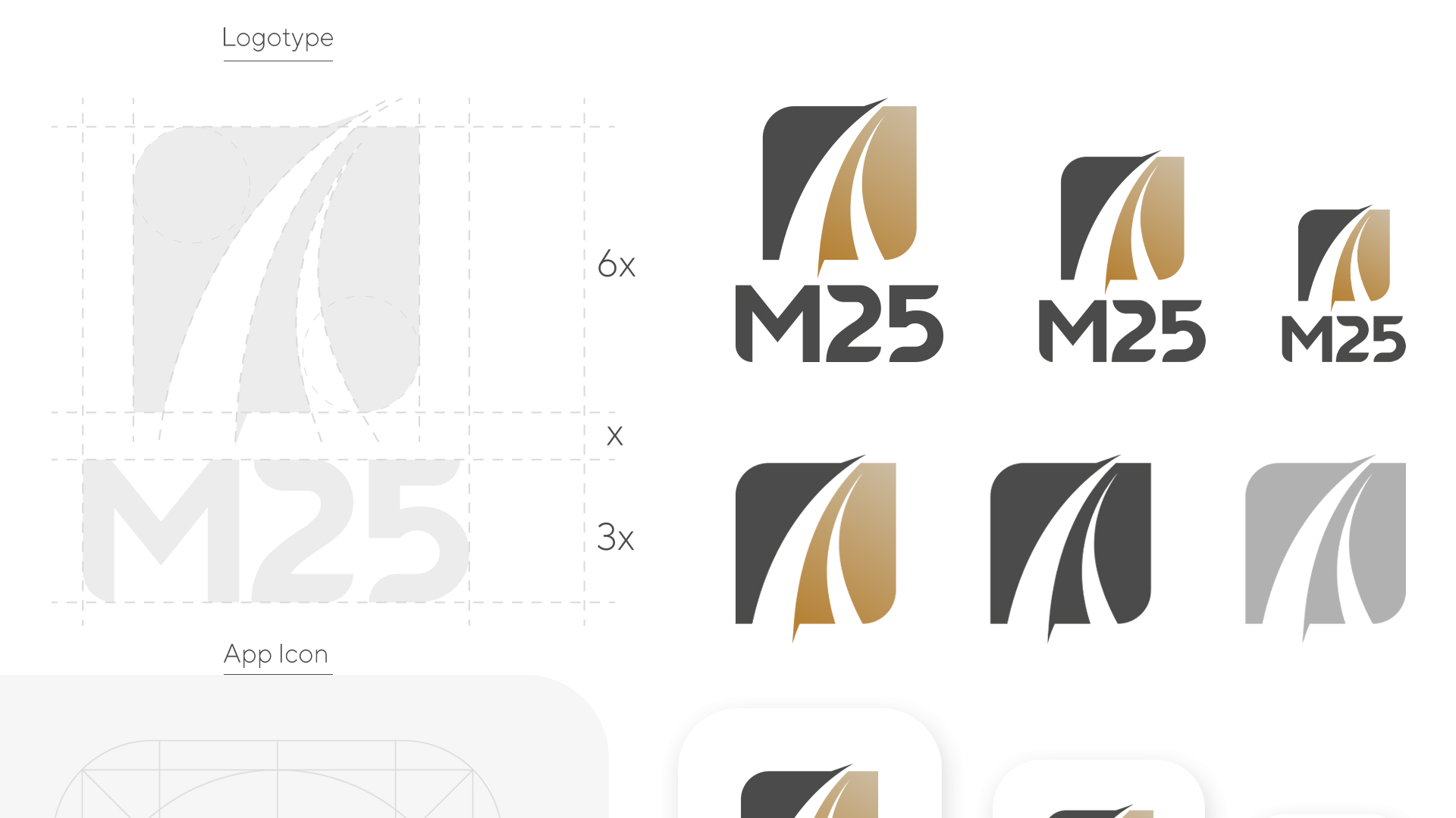
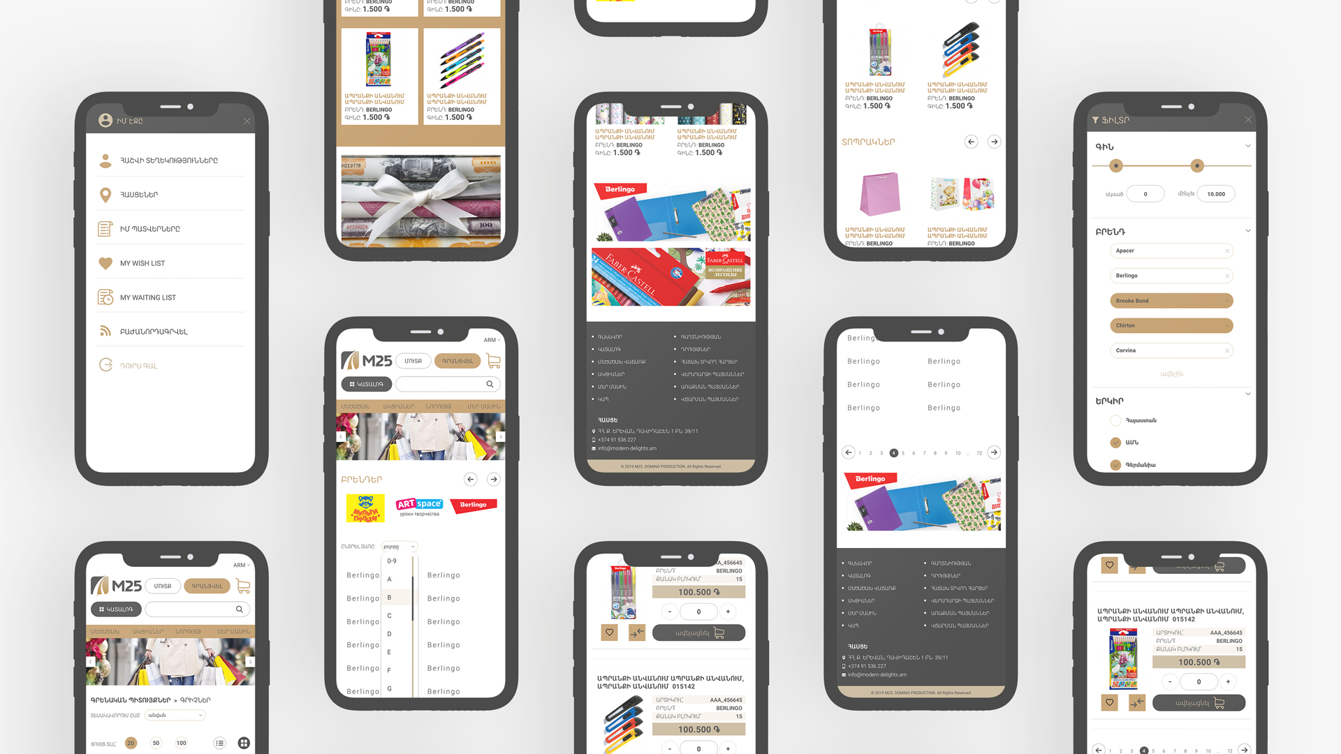
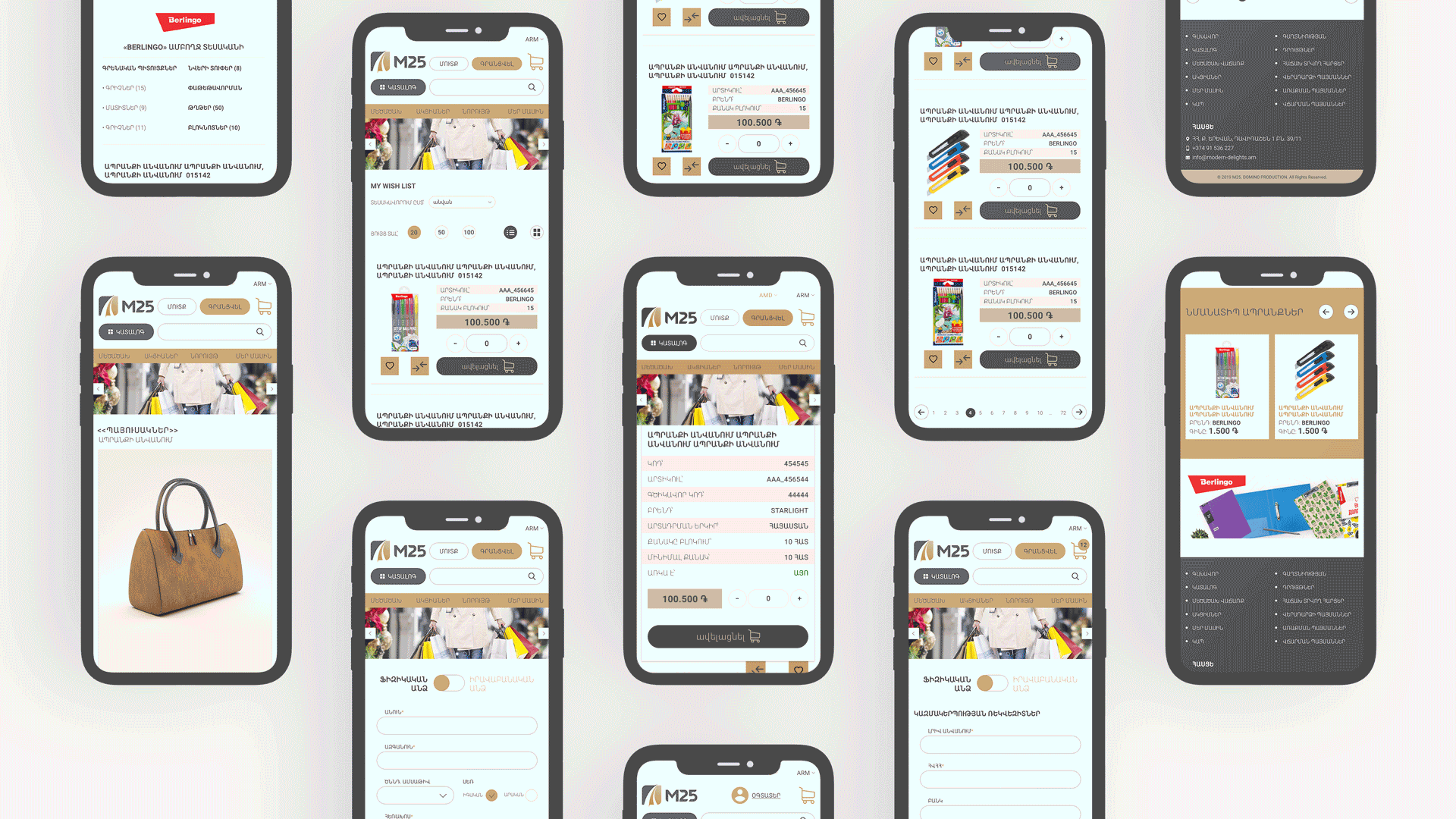
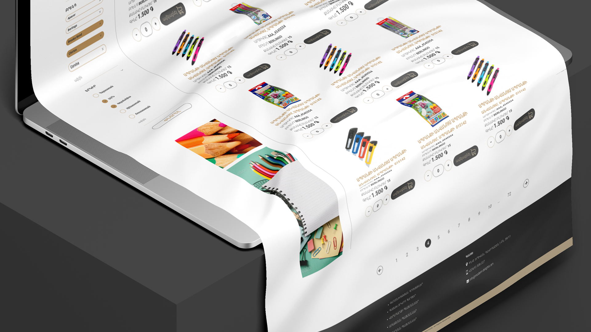

IN OUR BRANDING BRIGHTNESS AND ASCETICISM CAN LIVE TOGETHER!